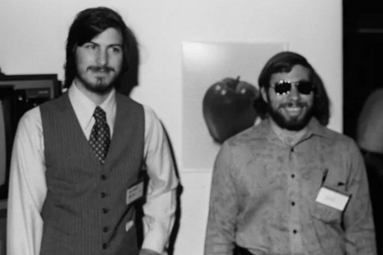
In the mid-1980s, after his dramatic departure from Apple, Steve Jobs found himself building a new computer company from scratch. NeXT was to be his redemption, a company focused on creating high-end workstations for education. For Jobs, who had always placed immense value on aesthetics and branding, securing the perfect logo was not merely a marketing exercise—it was fundamental to the company’s identity and success. What followed was a remarkable story of determination, negotiation, and mutual respect between two visionaries that resulted in one of the most expensive logos of its time.

Jobs had a clear target in mind: Paul Rand, the legendary graphic designer behind iconic corporate identities for IBM, ABC, UPS, and Westinghouse. There was just one problem—Rand had designed IBM’s logo and continued to work with them. In an industry where competitive boundaries were zealously guarded, approaching Rand posed a potential conflict of interest. For most entrepreneurs, this would have been a dead end. For Steve Jobs, it was merely an obstacle to overcome.

With characteristic persistence, Jobs attempted to reach IBM’s CEO John Akers directly. When those calls went unanswered, he continued pushing until he connected with IBM Vice President Paul Rizzo. After days of Jobs’ relentless pursuit, Rizzo made a pragmatic decision that reveals volumes about Jobs’ reputation for tenacity: trying to resist Jobs’ request was simply “a waste of time.” IBM reluctantly gave its blessing, and Jobs had his first victory.

The next challenge came when Jobs met with Rand to discuss the project. Jobs, notorious for his controlling nature and exacting standards, naturally expected to be presented with multiple design options to choose from.
![]()
Rand’s response shattered those expectations completely. “I’ll solve your problem, and you pay me,” the designer stated bluntly. “You can use what I produce or not, but I won’t present multiple options, and in either case, you’ll pay me.” The price tag: $100,000—a staggering sum in the mid-1980s.
For a man who famously micromanaged every detail at Apple, from the curvature of product corners to the exact shade of white in advertisements, Jobs’ response was remarkable. Rather than walking away from such restrictive terms, he recognized a kindred spirit—someone whose confidence in their craft matched his own. According to Walter Isaacson’s biography, Jobs saw through Rand’s “tough exterior” to identify someone who, “inside was like a teddy bear.” It was a rare moment where Jobs deferred to another’s expertise completely.
![]()
Two weeks later, Rand presented Jobs with a detailed design book that methodically walked through his creative process. The designer had explored numerous typefaces and formats before arriving at his solution: a tilted black cube containing the word “NeXT” with the “e” in lowercase and highlighted in a brighter color. The cube was positioned at a precise 28-degree angle, creating what Rand called “a study in contrasts” combining “informality, friendliness, and spontaneity” with “authority.”

Rand’s design thinking was remarkably thorough. He noted that “NEXT” in all capitals could be confused with “EXIT,” and the lowercase “e” created visual interest while symbolizing concepts relevant to the company’s educational mission: “education, excellence, expertise, exceptional, excitement.” The cube itself served as a memorable visual device that was “depictable, possesses the promise of meaning, and the pleasure of recognition.”

When presented with the final design, Jobs embraced virtually all aspects of Rand’s work, with just one minor objection to the brighter color used for the “e.” Rand firmly stood his ground: “I’ve been doing this for fifty years, and I know what I’m doing.” In perhaps the most surprising twist of the entire story, Jobs—the man known for insisting things be done his way—acquiesced completely.

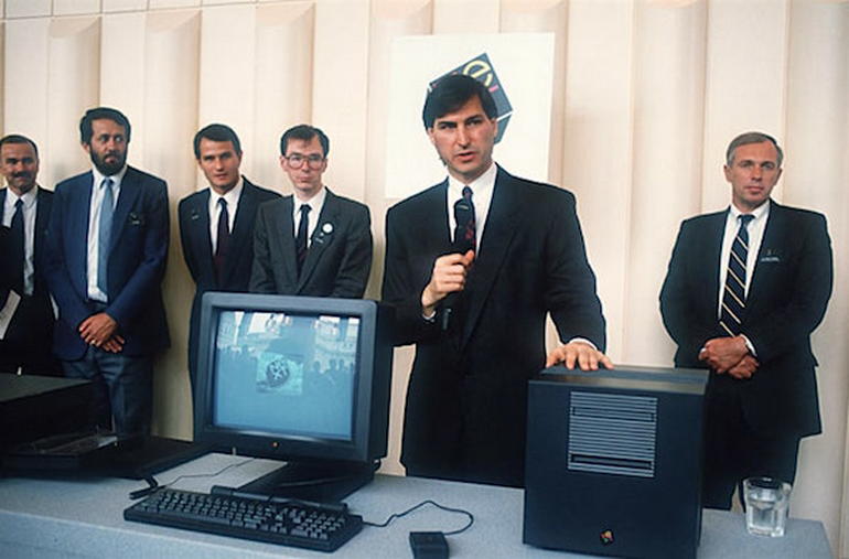
The NeXT logo became a design classic, though the company itself struggled commercially. However, the technologies developed at NeXT would later prove invaluable when Apple acquired the company in 1997, paving the way for Jobs’ triumphant return to the company he co-founded. The operating system that powered NeXT computers became the foundation for Mac OS X, while the development tools pioneered at NeXT influenced the creation of tools used by app developers today.
The $100,000 logo story encapsulates the essence of Steve Jobs’ approach to business and life. When convinced something was worth doing, no obstacle was too great—not corporate boundaries, not extraordinary costs, and sometimes, not even his own controlling tendencies. It also reveals a less-discussed aspect of Jobs’ character: his ability to recognize and respect excellence in others. In Paul Rand, Jobs found a creative force who matched his own unwavering confidence and commitment to perfection.
For designers and business leaders alike, the collaboration between Jobs and Rand remains a powerful reminder that sometimes, the most valuable business relationships aren’t about compromise or options—they’re about recognizing when you’ve found the right person for the job, removing every obstacle in their way, and then trusting them to deliver excellence, even when it comes with a hefty price tag.